I recently heard about a new competitor to Atlassian’s Jira called Clubhouse. In Forbes’ article, This New York Startup Just Raised $25 Million To Challenge Atlassian, they mention that Clubhouse has raised a Series B of $25 Million and appears to be a real challenger that could take some market share away from the giant Jira, who currently has 160,000 customers. Well, I as one of those loyal customers (hence my moniker Jira Coach), thought I could be best placed to share my first thoughts, impressions, and experiences as I play around with Clubhouse.
My first impressions of Clubhouse are mostly positive.
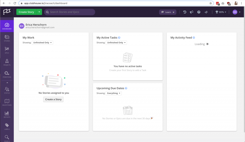
The Dashboard
I’m noticing the clean interface, (looks very similar to the default slack interface in the plum purple), and clear navigation options on the left pane. All of the options don’t have enough vertical space on my 15″ Macbook Pro screen at 100%, but do fit nicely at 90%.
Story Creation
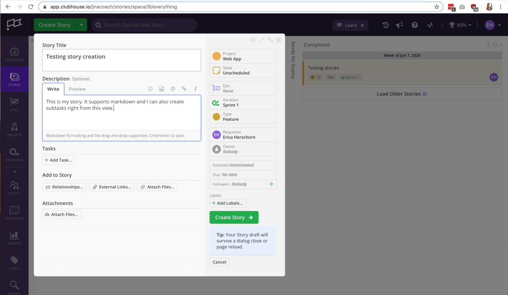
I’m really loving the story creation dialog box. Everything is in view as opposed to having to scroll (as is very common on Jira ticket creation).
I suspect that due to this sleek and compact layout, I won’t be able to add or remove any fields to this view, so I will dig around later to see if that’s possible.
Stories View
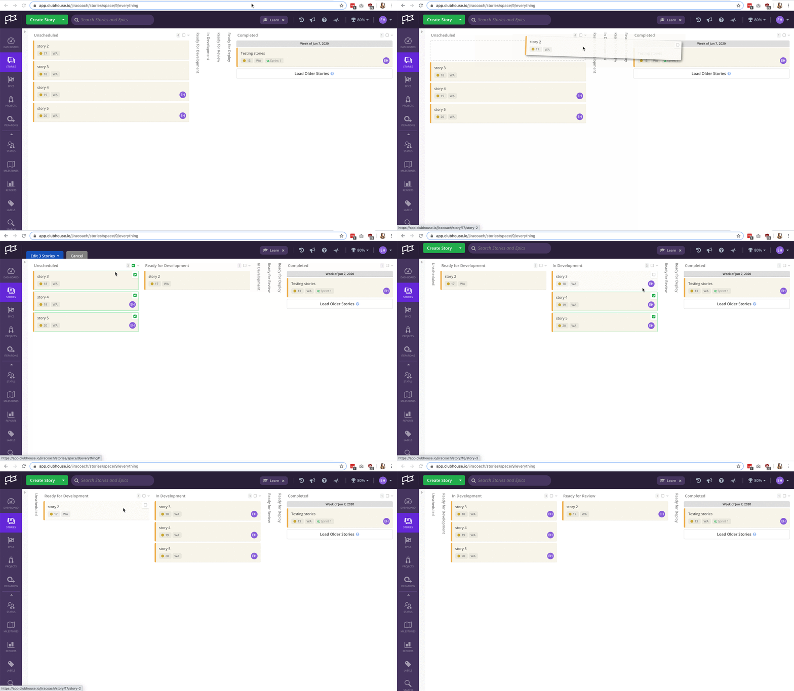
It looks like the “Stories View” is actually a Kanban board view. So I’m guessing all tasks will automatically be added to this story view for easy access.
It’s easy to drag and drop between columns, and the columns automatically collapse if there is nothing in it.
You can also bulk-move stories between columns very easily by selecting the checkbox in the top right of the first column – it is very responsive and there is absolutely no lag.
Epics View
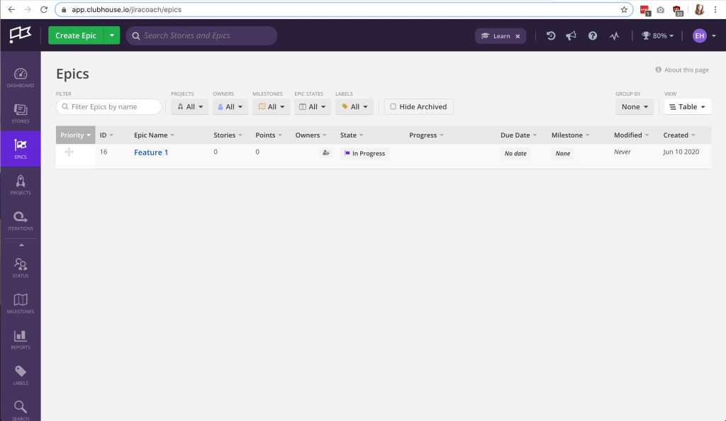
I think this view is great for a bird’s eye view of all created epics, and provides a nice clean faceted search option. You have the option of viewing the epics on a table or on a board view, though the board view doesn’t appear to allow for drag and drop, similar to the story view.
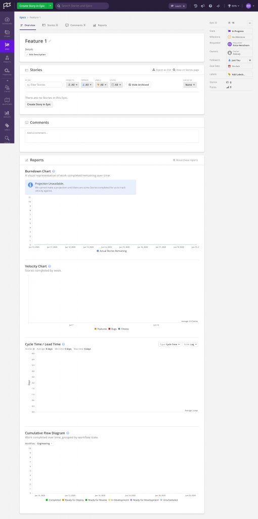
Detailed Epic View
WOW. I absolutely love how this view includes a burndown chart and velocity chart within this view without having to navigate away.
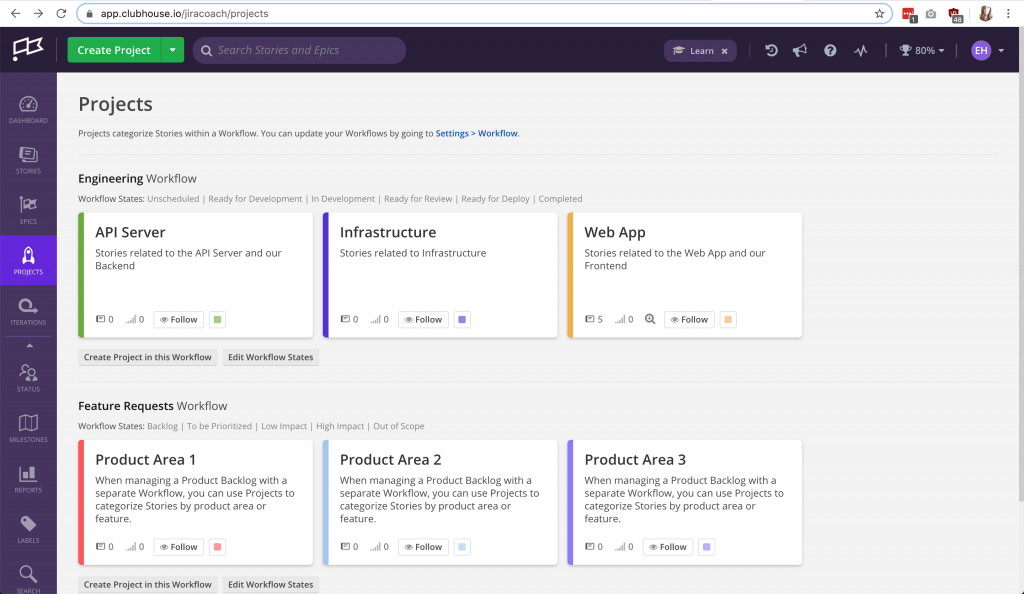
Projects View
I like the projects view, nice and simple, but I think the most useful part for me was this is where I’ve discovered you can edit the workflows.
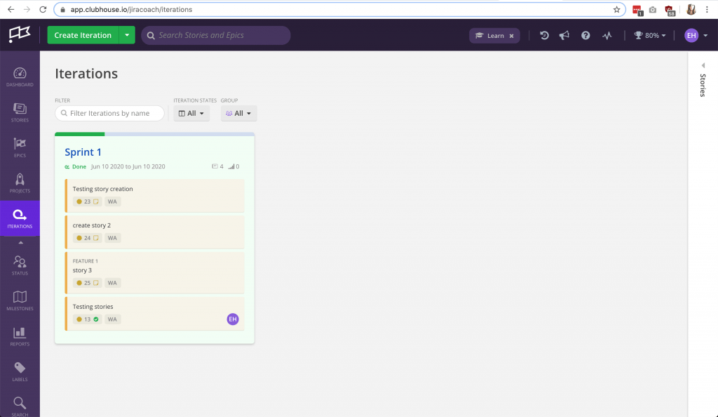
Iterations View
Ok so I get this is where I create an iteration or sprint, but I’m still trying to figure out where I see the board view for the sprint.
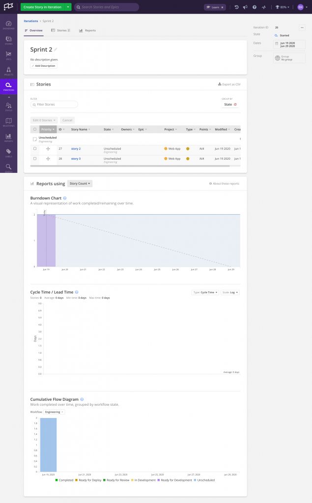
Detailed Sprint View
The sprint view has some nice metrics (similar to the Epics Detailed View), though I’m still trying to figure out where I can see my sprint view as a board 🤔.
I wonder if maybe that view doesn’t exist. It seems like if you tried to use the “stories” view, you’d be flooded by having your full backlog visible there. I’ve also gone back to check the stories view and there doesn’t seem to be a simple way to do any faceted filtering. Perhaps my head is too stuck in Jira land and it’s not actually needed if you have the view as identified above.
If you’ve used Clubhouse and you have anything to add to this post, feel free to comment below!

Leave a Reply